Work Experience at Bopgun – June 2018
29th June 2018
My name is Laila and I have come from Oldfield School to do Work Experience Week at Bopgun Design Studio from Monday the 25th June until Friday the 29th June.
Monday 25th
When I arrived I was introduced to the employees at Bopgun and was shown where I will be working for the week. I was then given a tour around the studio and set a task for the day. My task was to create and design a poster advertising the Deadpool Graphic Novel Collection by Hatchette Partworks LTD.
I created the poster using Photoshop CC 2015. I used Photoshop on an iMac to create the poster which I have never used before as I use Windows PCs in school. I have experience with using photoshop from Graphics year 7-9 and now during Media Studies which I started in September 2017. For the poster I used the colours red, black and white as these colours represent Deadpool and they are also eye catching. I needed it to be eye catching as the poster is for a bus stop ad this means I need it to be visible for people driving past in their cars. I also included photos of Deadpool himself, company logo/name, photos of the product, price of the product and mentioned you can win and receive free gifts just for signing up.
Tomorrow I will sit down with two of the designers at Bopgun and we will decide what I should keep and what I should remove to make it look more professional.
Tuesday 26th
I sat down with the designers and discussed my poster we labeled the assets of the poster most to least important. I removed the least important items such as extra photos of Deadpool and I made the important things bigger and stand out more. I changed the font colours from black to white and yellow to make it stand out more and look more appealing and not so dull. I also moved everything more central. I did this because of printing when you print you have a Bleed Area, Trim and Text/Safe Area. Some of my photos where going into the Bleed and Trim areas which means they may be cut off during the printing process.
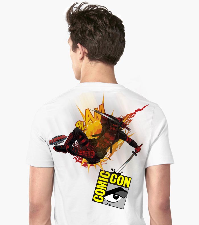
At the end of the day I was asked to start creating a t-shirt design for the Deadpool Collection and Comic Con. (Comic con is an event that allows people to meet their favourite actors from films such as the Marvel films and allows a lot more.) I started designing it putting on the Comic Con logo and a photo of Deadpool and will add more additions tomorrow.
Wednesday 27th
In the morning I finished my Deadpool and Comic Con t-shirt. I added a speech bubble from Deadpool to add more excitement to the shirt I also added the Deadpool collection logo for more advertisement for the company. I also designed the back of the t-shirt adding another photo of Deadpool and again the Comic Con logo. The back is Deadpool jumping with one of his weapons going into the Comic Con logo.
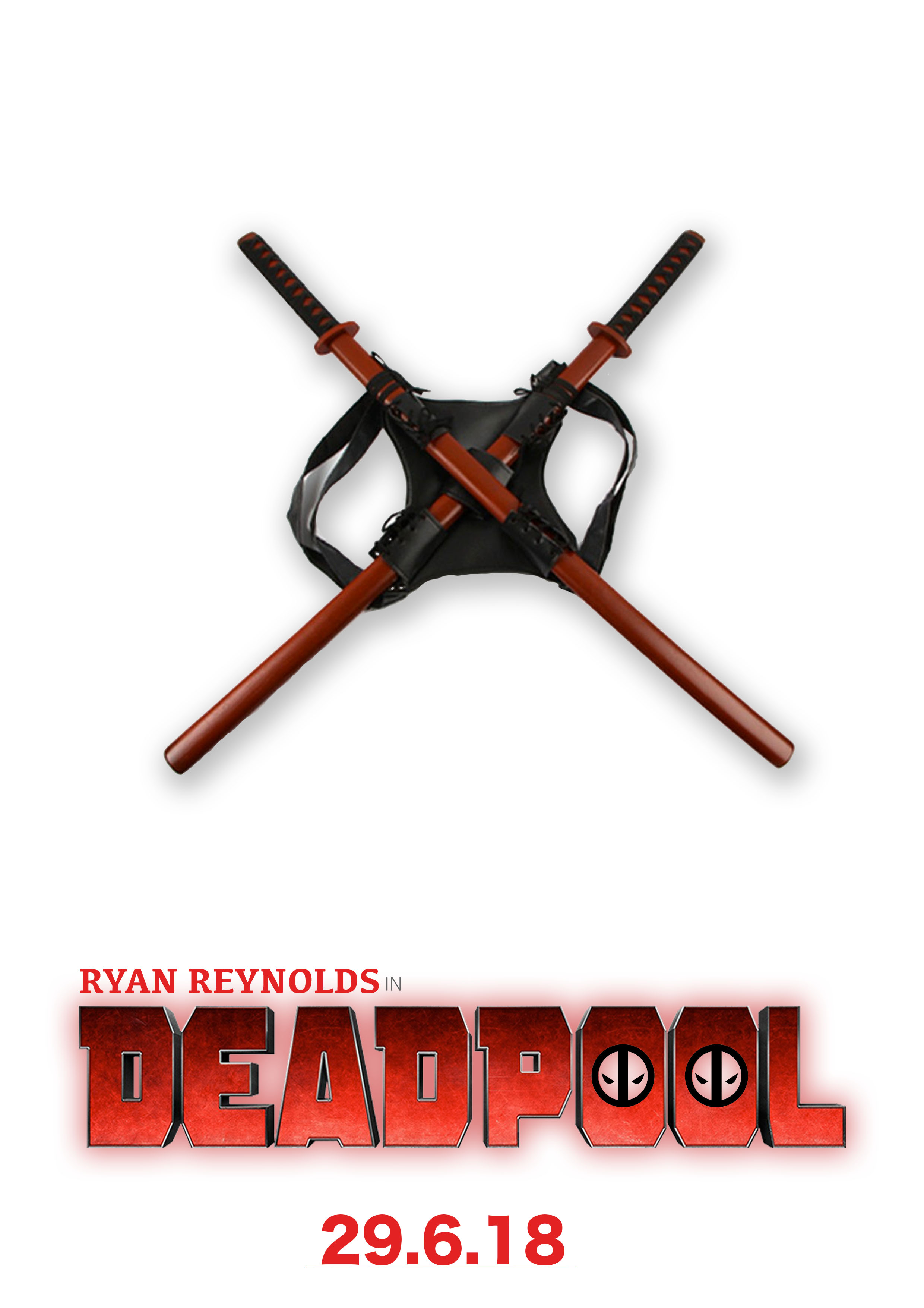
I also created one Deadpool theatrical poster to advertise the film in the afternoon and will continue to create two more tomorrow and then go on to make it look as though it is on a bus stop ad.
Thursday 28th
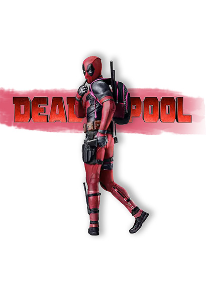
In the morning I created my other two theatrical posters for deadpool. My first one was a simple picture of Deadpool’s swords with a white background and the title of the film at the bottom. I also added ‘28.6.18’ at the bottom so people know the release date of the film. My second poster was inspired by the real Deadpool posters which consists of Deadpool standing in a white void with information around him and a slogan on the top. I also added ‘Marvel’ and ‘IMAX’ logos to make it look more professional.
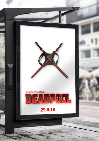
After I created these posters one of the designers, Jake, showed me how to put it into a bus stop using photoshop Smart Objects. I also leant how to use different settings and tools to help with my design and also in future designs. Tomorrow I will learn more about smart objects using the mock ups that are downloaded.
Friday 29th
Today is my final day of Work Experience at Bopgun. I have enjoyed working with everyone and brought some cookies to thank them for having me for the week.
I learnt some more about smart objects on photoshop and used my knowledge to design a magazine cover and put it onto a mock up cover. I designed the cover inspired by Empire Magazine’s style of magazine design. I added one main central image and then added short sentences of information around the outside in bubbles to make it look more interesting rather than it being just text. I also added four small photos in the corner so people have an idea of what they will be reading. I also added the date it was published (June 2018), price (£3.99) and a barcode to make it look more professional.
Overall, my week has been good and it helped me get an idea of what work is like, helped me improve my photoshop skills and also what kind of projects this line of work is involved in.


