Using animation to tell a story
28th April 2016
Perfecting the user experience is one of the most important areas in design, ensuring you capture your audience’s attention from the word go. From the moment they land on your website, the experience has to be flawless, easy to navigate and most of all captivating in its content and creative. And with an ever changing array of users it’s an ongoing challenge.
With this in mind, to get things ‘moving’, our best of the web subject this week is Animate.
Websites, leaflets, brochures, whatever the design medium, all needs to have a narrative and although there are many different ingredients in making this so, nothing is more important than how the journey is animated. Whether this is in the literal sense, as items move, pulse or a video that autoplays as you scroll, or the way something is written that moves your eye to a certain part of the screen, all are art forms of animating your mind to move where the author intends.
Click here for our ‘First find‘
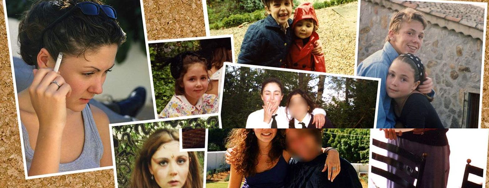
1. Undrawing My Tattoos – Story telling through animation
This is a captivating story of a girl who is having painful laser surgery to remove her tattoos. We love the way you’re drawn into her world with parallax scrolling and each section connecting like pages of a book. Showing painful photos and describing her experience and surroundings, creates the animation via the narrative.
The Tech bit we love here, is the autoplay of the video as you scroll down, meaning the user just has to sit back and enjoy with no action needed. And the use of photo montage imagery, revealing through parallax scrolling is a great way to a show a progression of her story. Would work well with before and after photos also.
Click here for ‘Find number Two’
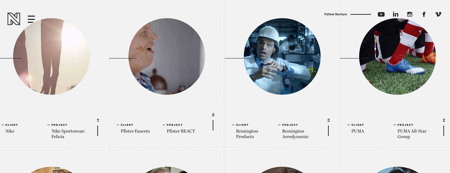
2. TraumaStudio – Animation as a presentation tool
This is a design favourite, showcasing work through the use of slick but simple animation. The diagonal lines and tone of the site divert your eye and act as a verification of where you are on screen at all times. Also the way the exit of a scene has been considered just as important as the entrance, these little touches make the whole experience impressive and crafted.
Click here for ‘Find number Three’
3. TraumaStudio – Animation as window story telling
The masking of letterforms on this site is lovely, making the actual story into the visual. It’s almost like a story inside a story as the video plays behind the letterforms that create it’s window. Also playing with where the user is on screen by adding a bit of creative and extra consideration that follows the cursor around. Generating validation of where the user is as well as a bit of playfulness to a somewhat usually standard device. Each part of the site has it’s own individual narratives which are activated as you hover over them, showing a summary of that project etc through a cut of video. Lovely. This is a perfect example of how animation can become the narrator when the verbal can’t be used.
Click here for ‘Find number Four’
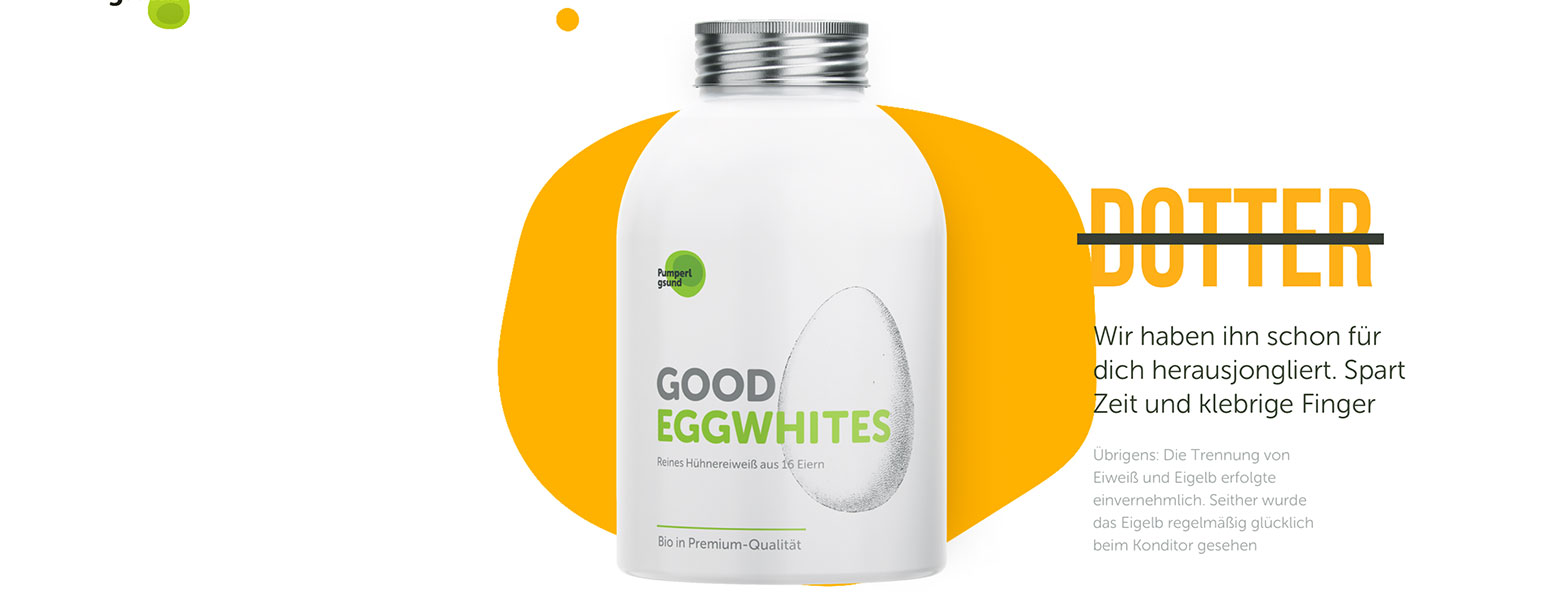
4. Good Eggwhites – Product user experience via animation
Showcasing a brand of liquid egg whites, this clever little site asks for the user to start, pause and tell its story for themselves by scrolling. As you move down the scroll we see the product appear with a clever combination of masking, where the narrative appears on the product as if it’s speaking for itself. Revealing the ingredients in lovely scroll activated chunks that keep you captivated. Also not asking the user to click anything to find out more, so only one repeated action to reveal all information, interesting device to use on e-commerce sites maybe, where the user doesn’t need to do much to find the full product information. Plus it looks fab.
Click here for ‘Find number Five’
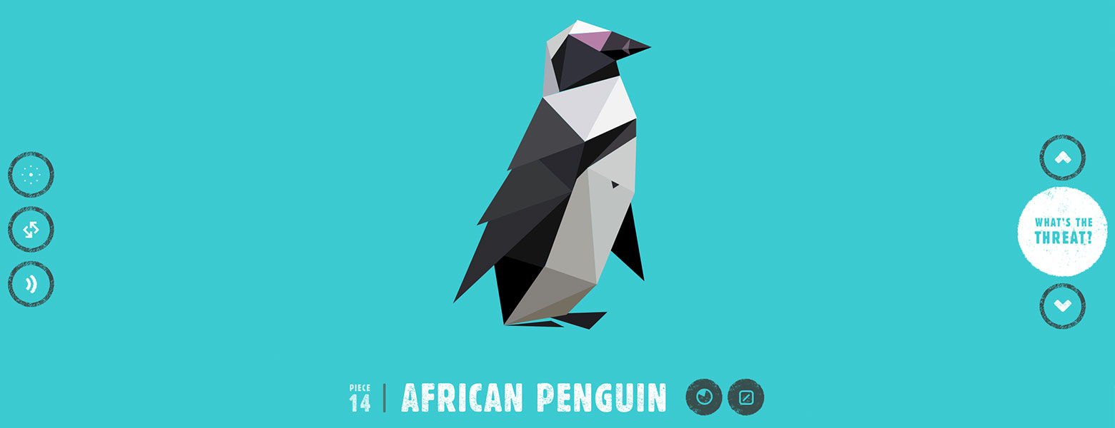
5. Species in Pieces – Beautiful Animation
Absolutely the star of the show for well crafted animation. A site that shows an exhibition of endangered species via some highly crafted origami like animal animations. Each segment changing and moving solo but also as one, to create a very clever and evocative piece of art. Covering both scroll and arrow activation to help user experience, makes this a clean, flawless and lovely way to get across such a massive issue, where it showcases the animals beauty captured within a cubist feel. This would be great as a set of screensavers. We love this.


