The hot areas of your website
12th January 2017
With an ever changing world of technology and audience trends, it can sometimes make it hard to keep up with audience expectation whilst still remaining ahead of the competition; and with audiences initially being the more magpie of creatures, being drawn in by design, colour and quirky headlines, it can be easy to get hung up on the ‘what’s’ and the ‘where’s’ in design whilst inevitably forgetting the most important questions of when, how and of course why. As with most design, there is always or should be a reason for creating and making a design decision, whether it be obvious or subconscious, and although there is constant testing and compatibility enabling via multiple device channels, for many designers the question still remains, what exactly is it about my design that works?
Dependent on ‘how deep down the rabbit hole’ you want to go of course, there are numerous channels in which to test the success of your website, whether this be through tracking links, PPC (Pay Per Click) or data collection through simple feedback forms, there are downloadable softwares available that can help companies manage their own surface level UI and UX to help analyse exactly what is and isn’t working. However, can often be an overlooked technology due to the cost of application and research resource, of course it’s the technology known as heat mapping and eye tracking.
What is heat mapping and eye tracking?
Just like the hunter uses heat signatures to distinguish where their prey is in a forest, a heat map is a graphical representation of data recorded from a user’s movements on a site, represented by colours, where generally red indicates the hottest areas and green/blue, the coldest. By mapping a session of a user’s time, we can monitor what part of a site’s structure and design entices the user to hover, click and read. Heat maps are often recorded as sessions as we can see the journey the user takes to what they do on your site, to them actually clicking the CTA. By recording numerous users, we can collate a general consensus of habits and mindsets of our audiences in hope of perfecting the user experience and developing our journeys.
Eye tracking is similar in the respect of recording sessions, but instead of concentrating on the physical movement of the user’s actions and clicks, it pinpoints our eye gaze by mapping where we first look to. Body language is a very powerful tool in design as it’s one of the most natural and subconscious elements that the user can’t control, therefore we can’t lie, so we get the most truthful outcomes. Our eye gaze and where we even hover on a site with our mouse can tell us a lot about what parts of our design is truly capturing the attention of the user and which are dead weight areas. Both of which can be extremely effective tools in successful customer engagement.
Top 6 most popular and dead weight spots
From heat map and eye tracking research, over the years there has been much speculation on which areas are more effective than others on websites; and of course it’s dependent on numerous aspects:
- Client’s personal needs and intentions
- Target audience
- Devices – An ever changing battle
- Content – the type of content you host on your site, e.g. mostly imagery, news stories, video content, case studies etc
- Type of website – E.g. e-commerce or brochure site.
However typically basing this on desktop, there are rough generic patterns that have emerged over the years and below we have picked out just 6 of our favourites:
1. F Shaped Pattern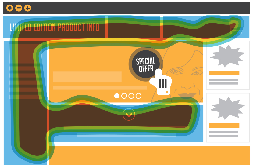
A pattern that has emerged from eye tracking research where the user reads in a pattern that includes two horizontal lines and a vertical. The user will often look to the top of the screen, left to right, back to the left, down the side, missing out any paragraph, along the screen again and back down the left vertical side. Also and this is a given really, keeping content short and sweet and even bitesized such as bullet pointed in places can aid in keeping your audience’s attention in this pattern, being a no time nation, this will help greatly. Concentrate our most important information in this area will ensure we keep customers engaged.
2. Directional reading – top left
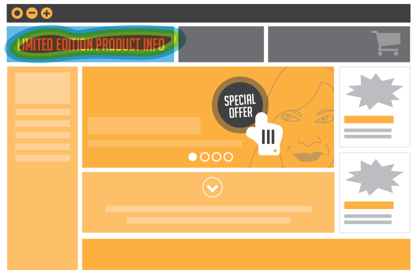
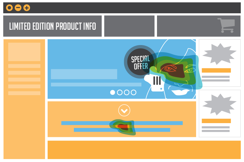
Dependent on what part of the world you come from of course, the general rule of thumb with reading patterns is that we go from left to right, front to back in our magazines and books. This has been said to be also mirrored on our websites. Our eye gaze generally starts at the top left corner of our site, which poses another great pointer, this is the area where you need to answer the user’s integral question, “Am I in the right place?” If through imagery or a few words you answer this via a CTA, price or special offer, you’ll keep your customer’s attention and prevent deviation or annoyance.
3. Active CTA
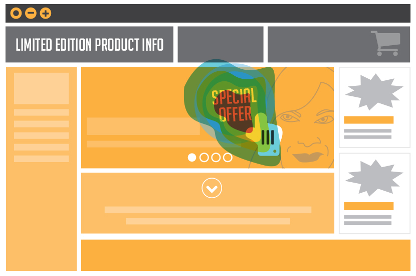
This sounds silly but making your CTA active. Heat mapping has shown us that users generally are attracted to roundels and jump outs that tell us prices, tel numbers or offers. They seem to circle the roundel with their cursors, almost like they’re memorising it. This makes sense then to make these roundels active links, e.g. a button, opposed to just an informative statement. We then capture their memory and action all in one go and therefore are not wasting a user’s action.
4. Banner blindness
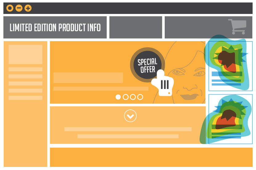
Quite a popular pointer. Basically refers to the media drenched side columns we see on most sites with companies advertising their products and services, popular examples for this are Google and Facebook. We are so used to seeing these adverts now that subconsciously our brains have programmed us into ignoring them, discarding them as spam. Therefore if something is designed on your website and placed in these zones or looks similar to one, we will automatically ignore it.
The same goes for automatic carousel banners which are starting to fall into this category. Used to compress content, but in an auto sequence makes it mimic an advert, making our brains think of it as spam. Plus, it’s human nature that generally we don’t like to be told to do something, so actively make that decision for ourselves by clicking arrows opposed to auto run will avoid falling into this category.
5. Above the fold
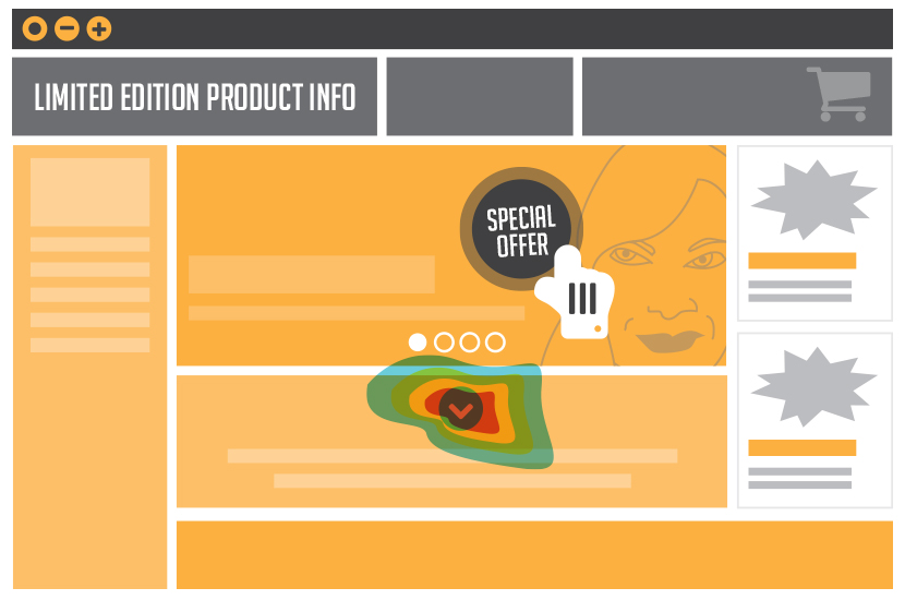
For years designers have been told of generic banner heights that we have to capture the user’s attention. Everything needs to be in this area etc. However heat map research has shown us that automatically users scroll down, sometimes all the way to the bottom as a sort of skim read and then recap by going back to the top to then read in more detail. Scrolling is expected, so not all information needs to be in this one area.
6. Visual pointers
This has always been a great way to draw the user’s eye, whether your content is visual or copy based, you can use the shape of copy and manipulate images to draw attention. E.g. using an image of a woman looking over to the CTA is more likely to pull the user’s gaze than a generic image of a woman looking to the front.
Emotion is also another great way of getting the user to connect with your brand. E.g. use a confident woman intensely gazing to your CTA opposed to a somewhat relaxed woman with a coffee. This will make the user connect with the image both directionally and emotionally and so direct them to what you want them to do.
The positives and negatives
There are of course so many reasons for using this research technique:
Learn More
You can learn more about your audience and habits so you can adapt your brand to fit their expectations.
Development and brand image
Keep up to date with trends, technology advances and audiences, as well as being seen as communicating with your user, creating a more caring persona for your brand.
Happy clients
Clients like to see the progress of their sites, how it’s doing, how to develop and apply more budget.
Happy designers
Good for us of course as we can even prove design decisions by doing AB testing to maybe show the client that by doing it a different way will bring more traffic.
However, can also be a tricky area:
Uncertain results
Until we have conducted the research we can’t be sure of the results. These could be fully negative and could discourage a client’s foresight.
Expense
This takes not only analysis but resource which can be, not always, at the expense of designers or the client to prove a point that once a client has seen may not like. But equally so, is that sometimes we need to go through to develop a brand, almost like a checklist to check off.
Efficiency unknown
Until we go down the rabbit hole you don’t know how effective or useless the research will be. It can be a gamble.
Trends and technology change
Once a site has been analysed, technology may change a week afterward, making the research useless. Therefore, no consistent formula.
The future?
Of course there’s numerous softwares out there that can help us track our websites which we can conduct ourselves. However currently the majority of this sort of research is conducted via market research sessions, where the individual is invited to look at a set of sites and as they do, their sessions are monitored.
However, my question is and this goes for the majority of market research, if this is meant to be a study essentially about random subconscious actions and movements, how can this be if the participants have been invited to be part of a study that they’re aware of? Of course they won’t know what the sites will be until they get to the session, but if all this is based on body language and our natural unaware behaviour, how can this be accurate if the individual is still aware that they are taking part of some sort of research? A complete chicken and egg situation no?
And of course it is unethical to conduct this sort of study without the individual’s consent. So how do we get around this?
Future thought and solution?
Last week we touched upon the ‘personalised internet’ data collection methods, which included google location. In the future it is possible that this kind of none invasive way of getting the user to simply grant us access and permission may be a way forward for this research to become more accurate. In terms of creating a pop up box on websites, like we have with ‘cookies’ policies and recorded phone calls for training purposes, a request as we enter a site that asks…
“For research purposes are you happy for your session to be monitored using eye tracking and heat mapping software?”
This then puts the power into the user’s hands but creates more accurate research that will inevitably not only help companies create more articulate websites but happier users also.
What are your thoughts?

