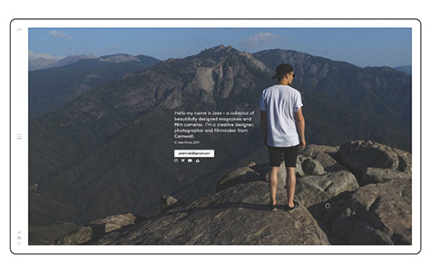
New Year | New Website
23rd January 2019
It’s hard enough to design and build your own photography website, but even harder to talk about it. It has taken 6 months of lunch times and late nights but myself and our developer Lloyd have finally pushed my photography website live. It all started back in June 2018 when I realised that the idea of my own (non-templated) photography website could be a reality. At the start of this process in July I posted my first blog post about website inspiration, with the original title of “Webspiration”. ?♂️
Following on from that, about a month into designing my own site I posted a blog piece about “Why are designers never satisfied?”. Still not feeling 100% satisfied that it was ready to go into development I delved even deeper into web design and more importantly photographers’ websites, trying to come up with some sort of plan for what mine should do and look like. See below a chronological order of what that looked like.
Sitemap
Because the site was my own and I knew it wasn’t going to be massive maze of a website – I made a mental site map that was flexible to change, bar the obvious homepage, portfolio and contact pages.
Design
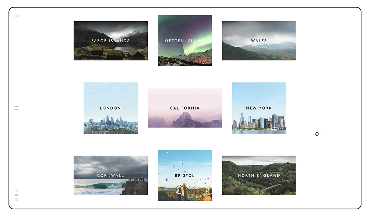
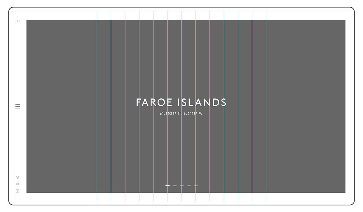
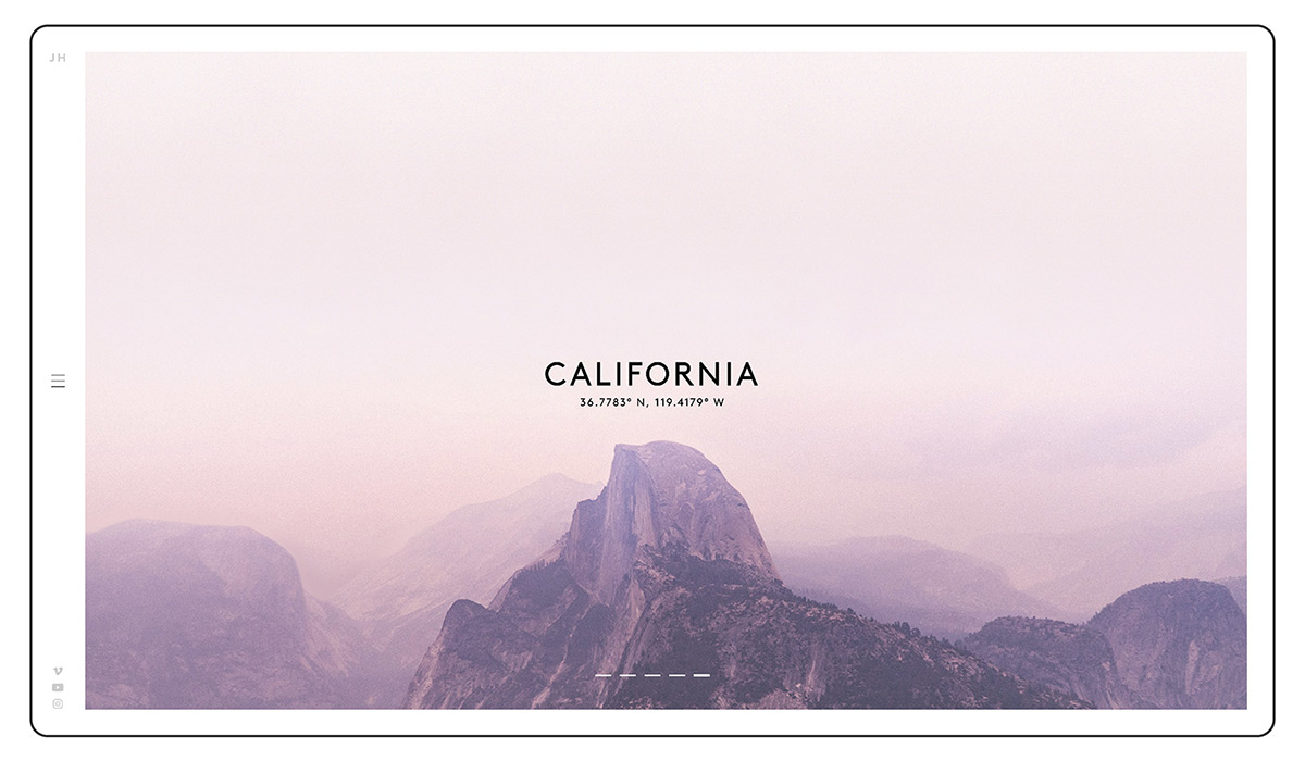
I started mocking up a rough grid that I could work from and then went straight into designing the homepage. The page that everyone would land on when visiting the site. It needed to be impactful, enticing and focus on my photography. The other pages sort of flowed from there, taking inspiration from everywhere and anywhere. From Instagram profile layouts to printed magazines and from design agency websites to motion graphics on dribble.
Build
“The main build of the website revolved around the content. A photography website should really let the images speak for themselves. Displaying Jakes images/videos in the best way possible was the main priority and that takes a lot of thinking before coding can even begin. We came up with a couple of sizes that all images would be optimised for and these could be used throughout the site and display well on all screen resolutions. With these foundations in place we spent a lot of time getting the layout of “Stories” right. The end result was 2 simple layouts with large images to let the Story tell itself.
To bring the site to life we added some subtle animations using parallax movement combined with size and placement transitions. These animated sections are fully editable via the WordPress CMS, using custom fields. This ensures Jake can add/edit/update all pages of the website without having to call in a Developer – one of the main benefits of building a site bespoke, its scalable and built for purpose.
One of the great things about the website is the way it has been optimised. Making use of the whole users screen gives us no boundaries, no limits. The websites works great on big iMac screens, right down to the smallest mobiles. At Bopgun we always build our websites to look great for all users. We polished off the website with a few extra features, one of those being a simple lazy load on our “Story” images. Lazy load essentially means that the images appear on scroll. Our lazy loading enhances the user journey and gives them control of the “Story”.“
Lloyd James – Head of Digital
Feedback
Receiving critique on design is fine when it’s for a client, but when you are the “client” and the designer – it becomes so much more personal. Design inevitably comes down to personal preference and I took on board feedback from everyone and anyone hoping that it would give me breadth of opinions and experience making it intuitive to use.
Last but not least is the ongoing development that needs to be managed on a weekly basis. The website has been live for about a month now and even from my own use I know I need to change, update and develop the site to make it as good as it can be.