Halloween packaging…Trick or treat?
27th October 2016
As that spooky day in all our calendars starts to approach, we start to see confectioners join in with the creepy shenanigans by playing with their packaging design and products. But what is all the fuss about? Why do such confectionery giants as Nestle Cadbury’s go to so much effort and expense for a holiday that lasts only one day?
Why?
Over the past decade Halloween has started to become more widely accepted by audiences as a fun but grim reason to dress up, host parties and stock up on treats; and with an ever growing appetite for gory horror films it’s easy to see why. But what is the reason brands go to such efforts? Is it purely trend?
Extending shelf presence
By participating in the season, brands can extend their presence on our shelves, literally. Cadbury’s have mastered this, take their Creme Egg for instance, revamped for the spooky season into the ‘Screme Egg’ or ‘Ghooost Egg’ as it is this year, a very clever strategy where they access both seasons and have a unique identity and following in both, through not only changing their name, but the product colour and design.
Increases visibility
By creating a product for the season you ensure that your product will be seen by all. Google surveys have told us that consumers actively use Google for research before they buy with the seasonal keyword searches, so by creating another product via the Halloween avenue, ensures you don’t get ignored until the season is over. Socially, it also shows that you’re a brand that likes to join in and be festive with it’s consumers.
Discounts and promotions
Another perfectly acceptable excuse to offer discounts to your consumers as well as an excuse to draw their eye in store with vividly dressed displays and shelves.
Market Research
You’ve probably noticed the ‘Limited Edition’ stamp on most Halloween packaging. This could have a dual purpose and here’s our thoughts why. More than any other holiday, Halloween being temporary in terms of time, being only one day and not a season persay, makes it perfect for brands to try out ideas on their consumers that are only temporary (limited edition). Ensuring that you still maintain the trusted original audience but can evaluate what works and doesn’t and therefore aids the brand to adjust their product accordingly.
Trick or TREAT?
As with most holidays, it’s purely focused on treats, making it perfect and almost acceptable to the healthy crowds as it’s a one day indulgence. Halloween is also said to be the third BIGGEST retail event behind Christmas and Easter, so why not?

Research
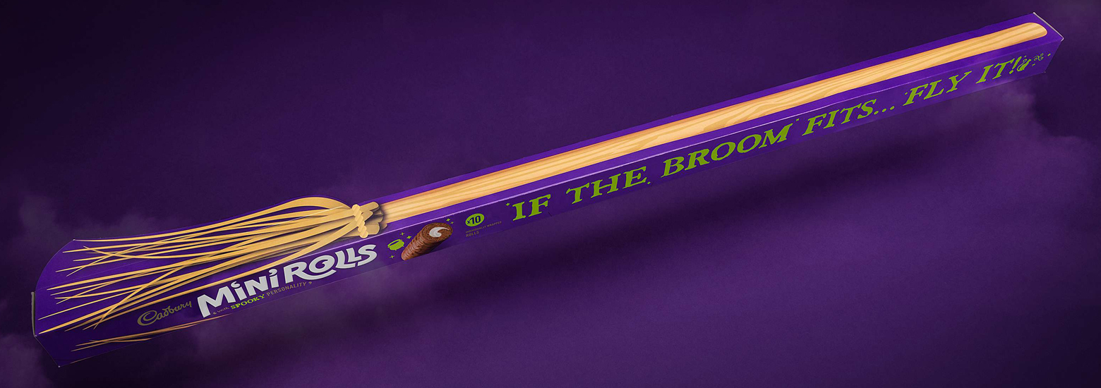
There are numerous ways a brand can appeal to the spooky season goers from the design, to the product itself. Checkout our collection of some of our favourite Halloween packaging.
Name changes are a common design trait in Halloween, a play on words or simply making your product sound ghoulish to join in with the season. But of course these brands have taken it another step, by changing their product temporarily, whether it’s using the same product and colouring it differently or recreating their product like Monster Munch have done by producing web shapes.


Challenge
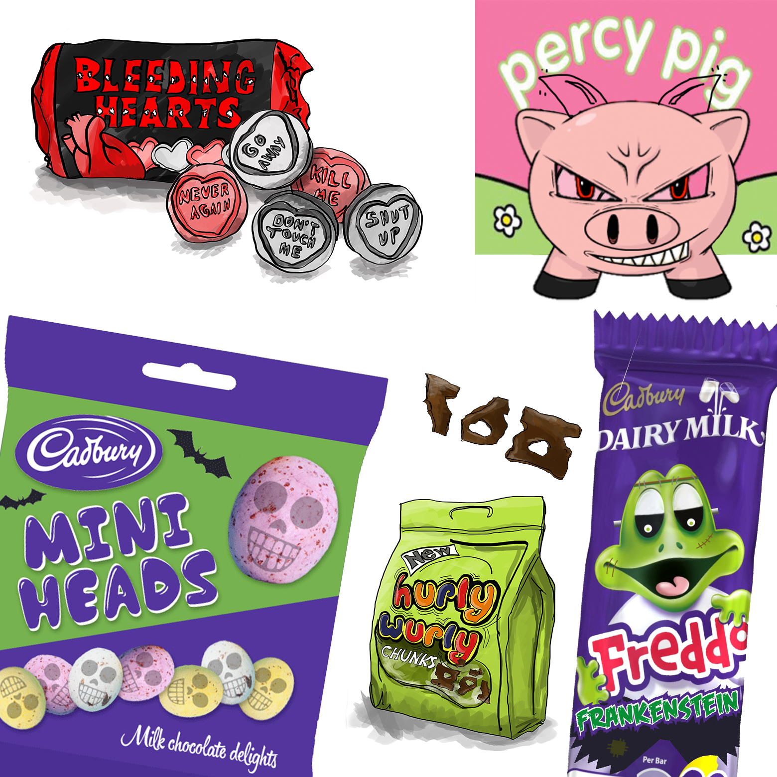
To get in the spirit of the spooky season, everyone from designers to account managers in the Bopgun team have taken on the challenge to redesign some existing confections but through creepy eyes. Check out the team’s quick designs below. From Evil Percy Pigs to ‘Sick of love bleeding hearts’ to the creepy Freddo Frankenstein, to Cadbury’s Mini Heads extending the Easter favourite into the Halloween period; to the Hurly Wurly chunks of Curly Wurly, bitesize pieces of hurl, a gruesome, revolting Halloween snack. Why not have a go yourself at rebranding a chocolate brand?


