What we have learnt from GDPR to create an engaging email campaign
25th May 2018
GDPR, it’s the dreaded word on everyone’s lips at the moment. Now we’ve already spoken about why GDPR isn’t as scary as everyone makes it out to be. Which if you haven’t read then we highly recommend you do. Like most Agencies and Companies, we have spent a fair amount of time dealing with the new GDPR regulations and sending out emails to get new data compliant lists.
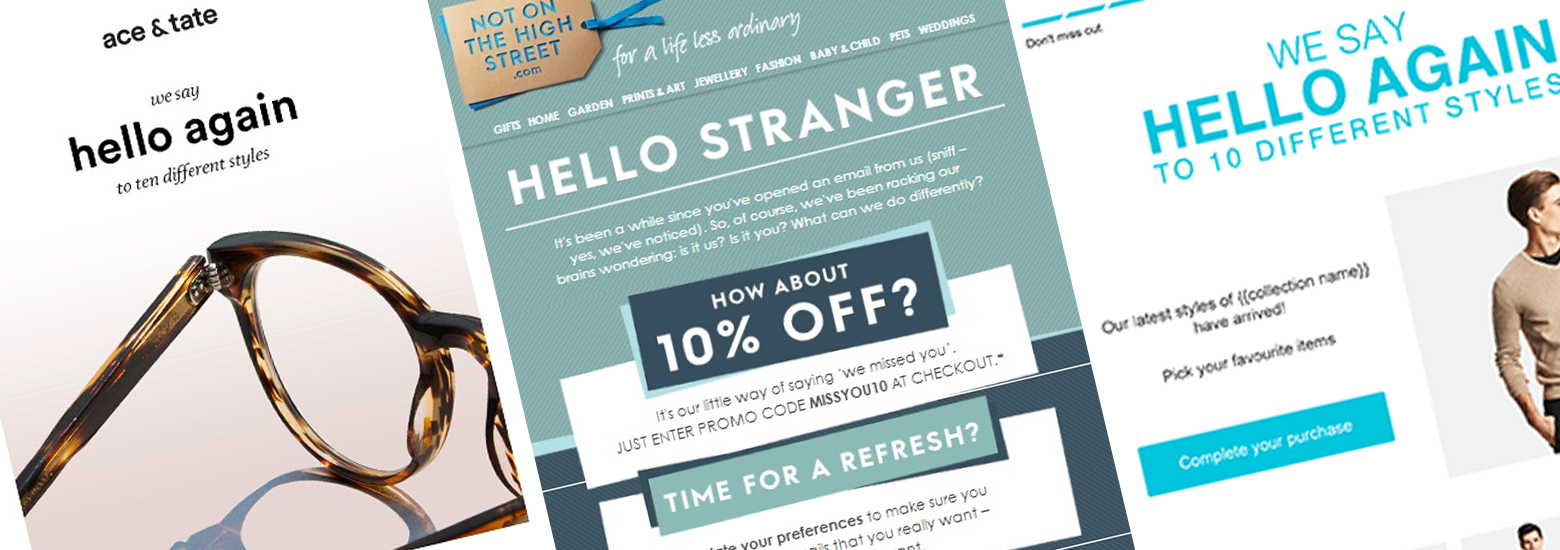
On any normal email campaign both copy and design are the two-key components to get right. However, with GDPR emails, let’s be honest, the content isn’t hugely engaging. Plus, with so many Opt-in emails floating around you need yours to stand out! This means that design plays an even higher part in engaging users. We wanted to share what we have learnt from our time with GDPR and how we can apply our new-found knowledge to further email campaigns.
Make links look like links
In any email campaign you want the best possible click-through rate, but GDPR has really made this a crucial point. Links sitting in paragraphs of copy should at a minimum be underlined, but for them to really stand out think about highlighting them with different colours or styles. Or if you want to go the extra step make key links into buttons that stand out.
Personalise headers and subject lines
Creating an interesting and relevant header and subject line may not seem like the most crucial aspect but you need it to be right to get people to even open the email. There’s little point in spending all you time on a great design if no-one is opening the email to see it! One of our favourites was for a client who were offering a discount code and the headline was ‘friends with benefits’. This is a great headline as it causes intrigue and suggests that something beneficial is waiting inside for users who take a look.
Don’t use too many images
As great as images are – and usually perfect for captivating audiences, it’s actually better to scale back the use of graphics in emails. Images may not always load in various service providers inboxes. So, although images can help to convey your message, don’t rely on them solely. Don’t forget to add alt and title text behind your images to ensure copy still appears if the image doesn’t load.
Tone of voice
Alongside the design being right, you need to get the tone of voice right too. When creating an email campaign, it is important to keep the audience in mind at all times. How can you best engage them? Do they respond to a casual approach or is a formal and direct approach more appropriate?
Test, test, test
Finally test! Before you send your campaign out to hundreds or thousands of recipients make sure everything works correctly. Send it out in-house, get colleagues to look over the email, test any links and check for spelling mistakes! If you’re sending it out on behalf of a client, send them a test. Once they’ve also approved it you know it’s ready to go.
Still need help?
If you want to talk about this further feel free to give us call on 01225 351715, send us an email at studio@bopgun.com or talk to us on any of our social platforms!


