7 tips for building effective subscription websites with great conversion rates
19th January 2016
There are many ways to approach the design of a subscription website or landing page, but all effective sites have one thing in common: they convert leads into subscribers.
Bopgun specialise in building subscription websites with excellent conversion rates. The branding and imagery for the different magazines and subscription products we’ve worked on has of course varied enormously, but over the years we’ve learned that there are certain key principles that apply to all successful sites.
Here are our 7 key tips for gaining great conversion rates from your subscription website, including one simple action that could potentially double your sales….
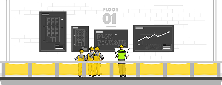
1. Plan the site structure with the customer journey in mind
The purpose of a subscription website is to take the customer from the landing page to a completed order as smoothly as possible.
The key to this is to think like a customer when designing the structure of the site. The user should be able to follow a natural, effortless journey to the checkout, and should also be able to easily get to the checkout from wherever they are on the site.
At Bopgun we invest a lot of time with our clients to work out the best journey around the site, well before we let our designers loose on colours and images. We’re looking to build a site with low bounce rates, good engagement (as shown by a length of time on the site and number of pages read), and of course a great conversion rate, measured by the number of unique visitors vs those who complete an order.
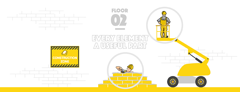
2. Make every element a useful part of the conversion process
A subscription website should be attractive and should match the quality of your magazine or product. But it should also be a simple, useful means for the consumer to find out about prices and how to order.
When planning what to include in the site, it pays to question every element you introduce. Why do you need it? How does it benefit the user’s experience? Does it help the user to make a purchase decision?
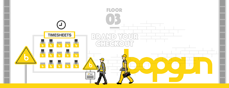
3. Ensure that your checkout is branded
Our experience shows that e-commerce sites with branded purchase pages have better conversion rates than those that merely leave the standard fulfilment house design in place.
Branded checkouts designed in line with the rest of the site are more reassuring, so customers are significantly less likely to lose confidence at that final hurdle of entering payment details.
For the same reason, it can pay to clearly display your company contact information and a customer service phone number. Hiding contact information may reduce increase a user’s trust in the site when it comes to paying.
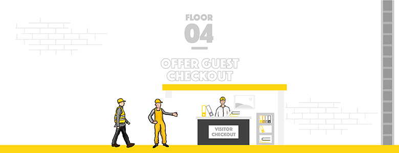
4. Offer guest checkout – but don’t force users to sign in to order
It is not usually a good idea to force the users to sign in before they can place an order – many people will be hesitant and will exit the site immediately.
Of course, the reality is that the customer still has to fill out the same information if they don’t sign in, however the option of a guest checkout means the customer can feel in control of the purchase and it is likely to result in more sales. Guest sign-ins are particularly attractive if they can be quickly and easily done via a social media account like Facebook, Twitter or Instagram.
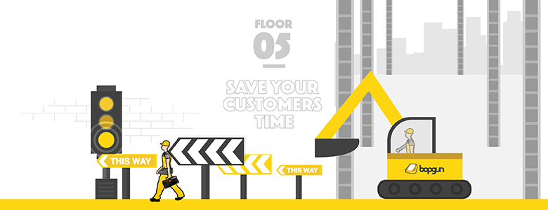
5. Save your customers as much time and effort as possible
In other words: don’t make it easy for users to abandon baskets.
Simple data scraping tools will enable you to carry across information the customer has already entered to the checkout page, while address look-up and auto-fill will save them completing lengthy forms.
The easier you make it for customers to complete the forms, the better their experience and the less likely it is that they will abandon their basket before purchase or phone the helpline.
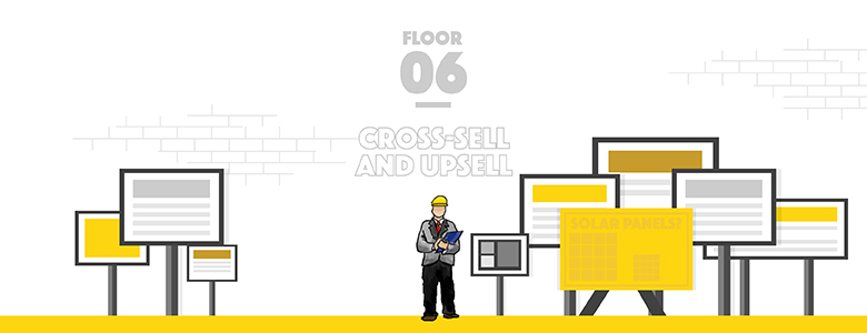
6. Upsell and cross-sell as part of the order process
Don’t miss simple opportunities to upsell and cross-sell products and packages, if these can easily be built into the checkout process.
If you have multiple products, the option ‘Add to basket’ is better than ‘Buy now’, as it will encourage users to browse around the site for more options before leaving it via checkout.
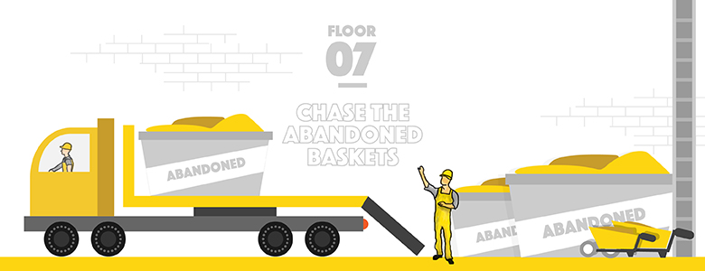
7. Chase abandoned baskets to double your conversion rates
This is a really important tip for increasing conversions. There are many reasons why customers abandon a basket, but very often it is because they have been distracted by something else.
A branded email that reminds them what they have left in the basket can be the trigger they need to finish the job.
At Bopgun we’ve found that building in a system that automatically sends follow up emails to users with abandoned baskets is an extremely effective sales strategy: in one case, when the abandoned basket orders were added to the first visit checkouts, we found that conversion rates had more than doubled!
If you’ve invested time and money in marketing emails, mailers and PPC, it is essential that your websites and landing pages are effective in getting the final job done and converting leads into subscribers.
The right technology can dramatically increase your conversion rates – but it needs to be combined with an understanding of e-commerce web design and user experience.
If you’d like a chat about how we can help deliver better conversion rates from your subscription websites, get in touch here.
Bopgun specialise in subscription and e-commerce conversion websites, landing pages and email marketing campaigns for subscription-based business. We’ve worked on major campaigns for Hachette Partworks, Immediate Media, Future and many more – doing everything from initial creative concepts right through to effective campaign flow management and tracking results.
Check out some examples of our work at www.bopgun.com

